Team Members: Magdalena Dobra, Tirsa Fernandez, Sophie Toledano
Safe Nest is an incident reporting system designed for healthcare professionals, especially nurses, to easily report any safety or clinical concerns that arise during patient care.
Problem Statement
Error reporting systems in health care ensure patient safety by identifying risks, errors, and their causes. There is an absence of a comprehensive approach to error reporting systems that fosters trust, encourages reporting, and facilitates the action of creating a report. Therefore, there is a need for an error reporting system tailored to nurses, addressing these challenges to enhance patient safety and quality of care.
Objectives
Design a responsive employee portal that simplifies communication and meets OSHA compliance standards.
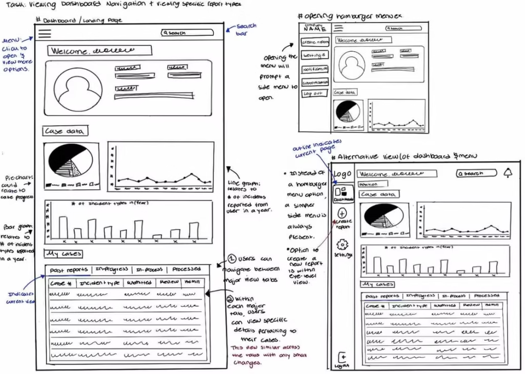
Create a dashboard overview to help users quickly access their case data.
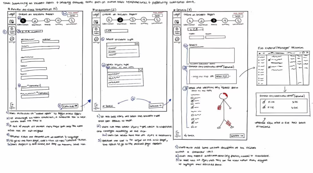
Redesigned the incident report submission process to align with OSHA-301 requirements.
Target Audience
Certified Nurse Aides
Certified Medical Aides
Licensed Vocational Nurses
Administrators
Role in the Team
UX and visual design
Research
Information architecture
Interactive prototype development
Branding
concept map & sketches
Colors
Logo
Typography
Iconography
Active
Inactive
Wireframes
User testing
We conducted three usability testing sessions using our first prototype and the feedback capture grid method, with one moderator, observer, and tester per session. Afterward, we compiled and analyzed our findings.
Testing Goals:
Evaluate if the dashboard visuals provided relevant information for nurses.
Observe user flow and challenges during the incident report creation process.
Identify points of confusion while navigating the report repository and notifications.
Assess ease of attaching files following standard iOS behavior.
Test how easily users located report history and comments in completed reports.
Measure how intuitive features felt, such as creating notes, filtering tasks, and selecting injury locations on the body diagram.
Results:
Participants responded positively to the overall design, praising the color scheme, dashboard visuals, and body template. However, several usability issues emerged, including confusing dropdown menus, unclear status bar colors, and small or inconsistent icons. Some users struggled with non-editable fields that appeared editable and suggested clearer labels and darker text. Others recommended adding an overlay when transitioning from graphs to reports and simplifying the summary layout to avoid visual overload. Despite minor glitches, all participants found the app visually engaging, organized, and easy to navigate.
Final Prototype
Next steps
Moving forward, we plan to refine key elements to improve clarity and usability across the app. The status labels will be redesigned to make each report’s state more immediately understandable. We’ll also adjust the form fields to clearly differentiate between pre-filled and editable information, reducing confusion during report creation. Lastly, we’ll enhance overall readability by increasing text sizes and applying bolder iconography throughout the dashboard, ensuring a more accessible and visually balanced experience for users.
takeaways
This project deepened my understanding of building responsive products that meet real-world industry standards while integrating external data. It also helped me explore how to present complex information clearly through thoughtful data visualization and user-friendly form design.